

I’m overjoyed that the book has garnered some great feedback since its release in March 2019. However one aspect of the book that has always been a big talking point has been its cover design choice…
A ‘Marmite’ reputation…
Some people have told me that they like the book cover design. It’s different. It’s non-traditional. It’s punk!
However some other people have also told me that they really don’t like it. A good friend of mine told me that if he didn’t already know me, he never would have bought it – because he didn’t like the cover. This wasn’t an isolated incident either… When the book was reviewed by the Being Freelance Book Club, one reader explained that the cover had put them off buying/reading it previously. And in a private Facebook group for freelancers (so I can’t link to it or screenshot it), a designer said: “Wonder if there’s any chance that Steve would let me design a nice cover for him.” Ouch. 😵
We’ve all heard the famous saying: “don’t judge a book by its cover” – and I know that a lot of people have looked past the book’s cover and enjoyed the contents within. But when you hear that people are put off from buying it, it makes you wonder… Did I make the right choice with it?
It got to the point where negative comments like the above made me start thinking if an entire overhaul was needed – until I received feedback from the judges of the Wishing Shelf Awards 2020, in which Anti-Sell was a finalist. In their feedback (which was also posted on Amazon as a review), they said “14 [out of 17 readers/judges] thought the cover was good or excellent.” It should be noted that the judges are all avid readers, and some of them are self-employed themselves – so the ideal target audience to boot.
So at this point, I had no idea what to think. 😂 Some people liked/loved it, some people hated it. It had gotten a Marmite reputation! (For the non-Brit readers, Marmite is a food spread with a ‘love it or hate it’ reputation – so much so that they even incorporated it into their marketing in the 1990s…)
Look what’s just arrived at the Centre! 📚
If you hate sales but want to find ways to network and create business leads without the cliche sales pitch, come in and pick up a copy of @steviephil “Anti-Sell” book! #AntiSell pic.twitter.com/2FsI5el2bu
— Centre for Entrepreneurship at Cardiff Met (@CardiffMetEnt) March 11, 2020
The design decisions
Well, there’s one point that might help to explain how/why the design choice came to be, and I realised recently that not many people would know this (hence why I wanted to post this post): it was never intended to be made into paperback format.
When I hired the designer (Emily of Studio Hicks) to create it, I only had my eye on eBook (Kindle & PDF) and audiobook formats – i.e. purely digital. And I think the cover works well when it’s shown digitally – either rectangularly on a Kindle device, or as a square on someone’s phone. In fact, Emily is a graphic designer (and an excellent one, I should add) – but she’s not a traditional book cover designer, and she made this clear to me when I hired her.
But then, around the time the book was nearly ready to be put out into the world, I learnt about Amazon’s newly-launched print on demand service, via their Kindle Direct Publishing (KDP) platform. This allowed publishers to release paperback versions of their self-published books as well, where Amazon would take care of the entire process – from ordering to printing to fulfilment and delivery. How could I say no to that?
I talked to Emily about it, and I stressed to her that if she didn’t want to do the paperback version as well (as she wasn’t a traditional book cover designer) then I could hire someone else to take care of that part of it – but she was happy to give it a go.

We stuck with the same design: the ‘zine’ look, as I like to call it. “ANTI-SELL” written in a style not dissimilar to a punk-rock band’s logo, with the rectangle containing the businesswoman (whose look was inspired by the Scott Pilgrim comics) and the thought bubble with the currency symbols (which was originally three pound signs, but then in a later version we changed it to a pound sign, a dollar sign and a Euro sign; see the “Paperback cover design” subheading on this post for the full story of the redesign).
We toyed with other ideas as well: a half-and-half woman (half businesswoman, half punk) and a woman looking in the mirror with her punk reflection looking back:
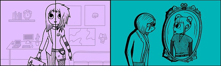
I should add as well: the look/style/feel of the book cover – I guess you could say the ‘vision’ of it – was all directed by me, not Emily. If anyone doesn’t like the book cover, then it’s my fault, not hers. She just ran with what I had in mind for it.
Going against tradition
Look, let’s face it: if the book were a traditional business book giving traditional business advice, then I’d be the first to admit that it’d be a terrible book cover design choice. 😅
But it’s not a traditional business book giving traditional business advice.
It is the ‘anti-sales’ sales book. It’s different by name and by nature. To get that message across, it also needed a different book cover – at least in my view.
I guess I could’ve gone with something a bit more traditional – just some words, so no image/illustration – but hey… Where’s the fun in that? 😈
The thing is as well: you can’t please everyone. Seriously, you literally can’t. If I had gone with something a bit more traditional, then that version might’ve had its haters as well. You can’t win, no matter what.
This post isn’t meant as an ‘in defence of…’ type thing. But I thought that explaining how it came to be might help people to realise that the thinking behind it – and the decisions that were made on it – all helped to lead it to its non-traditional look. A look I like, and – thankfully – a good number of other people do, too.
